I apologize in advance if any of these are too harsh.  If they are, please forgive me - I didn't intend to be mean.

Vixyz & general thoughts on them.

Vixyz 117 - Zephyre
I compared the old design to the new one.  My first thoughts were: What happened to his awesome ice crystal hair?
The original drawing had some dramatic things that immediately caught the viewer's eye.  Wide wings, crystal hair, and excellently shaded eyes.
Zephyre's more human update isn't as exciting.  Proudly whip his wings outwards and bring back that awesome crystal hair!  That's my suggestion.

You'll want to have your drawings immediately catch peoples' attention. Pick some illustrations that others have made and ask yourself - why do I like this picture?  Steal those ideas!  Seriously.  The best artists draw from the work of others - pun intended.   ^_^;

Also, rather than detail a long list of things in dArt's comments, add 3-4 comments to the image itself.   Simple stuff, like the character's name, their major ability/abilities, the major personality type, & some interesting and/or silly bit of information about them  (for example: has never lost a hot dog eating contest / is actually dating two men at the same time! / has a beautiful singing voice despite being able to spit fireballs / etcetera... ).   It's okay to have biographical information, however more time and effort should be spent on the actual drawing.  Notes in comments should add something meaningful to the picture.

Vixyz 116 - Zeezaany Vortex
I immediately thought "Electronic Demon" when I looked at her.
Good:  You did well putting the arc of electricity in her hair.  Blue claws.
Not so good:  The electrical cord tail is a novel touch, and tells me her power is electrically based, but it doesn't match the dangerous look in her eyes.  Now, if the cord pointed at the viewer, and also had electricity in it, then I'd think she was dangerous.   That alone would give the viewer a good idea of her personality.
The techno-wings.  I really like their shape, but the symbols on them aren't very exciting.  Now, if you used a pattern from a computer motherboard (green with gold line) and made the majority green match her hair, then they'd add something.

Lastly, overall, she doesn't appear very exciting.  I'm not sure if you were going for the "geeky computer loner" look, or not?  If you were, please then disregard this comment.  ^_^

Vixyz 115 - Zankooro, Ice king
Good: He's BIG and clearly draconic.
Not so good:  Why is a regal king squishing himself into a square box to fit in the picture?  He's a king - they have huge egos with equally huge bodies, and they're not afraid to show them off.
The ice crystal on his tail looks a lot like a dagger.   I wasn't able to tell that it was ice at first.  Now, if it was bigger, partially translucent, and reflected light in places like ice, then I would've immediately realized what it was.

Lastly, please consider lengthening his mustache, because of his age?  The mustache that is there is great, just extend it straight down from where it currently ends.

Vixyz 114 - Zamida
I love her.  She has a detailed write up below.

Vixyz 113 - Zack
So cute!  I immediately fell in love with with this anthro peppermint-stick-tailed squirrel.
Good: He looks like he's made out of different kinds of candy; Peppermint sticks, chocolate, candy corn, orange and vanilla lozenges, an M&M on his neck, and cotton candy, with jelly bean eyes.  He's definitely visually interesting.  See, someone else thought so, too.  You got a comment on his page!
Not so good: Only one thing; his face could be a little more complex.

Vixyz 112 - Yuki
Good: Your Sonic Art influence is showing.  She has a very attractive body.
Not so good: Her face seems a little flat, and also vertically "squished".  Her head doesn't seem to be round.  Notice how all of her facial features (eyes, nose, and mouth) can fit within the shape of a rectangle?  Now take a look at other Anthro art.  Most peoples' faces fit within the shape of an equilateral triangle.
The two left nails on her right foot (from the viewer's vantage) are pointing the wrong way.  They should point in, towards an invisible line at the center of her body.  Her left foot is fine.

Vixyz 111 - Yvaine
Yay!  A very pretty angel with nice posture, facial expression, and good face proportion. 
Good:  The wings are great, and you did a great job on her sandals - even capturing how her left foot's toes (again, viewer's perspective) are small because they are further away from the viewer.
Not so good: 
Her left forearm is too short.  Her right hip looks too small, it doesn't stick out nearly enough, the other one is fine, tho.  ^_^

Consider adding some light grey coloured "V"s to her wings to give the impression of feathers.

Vixyz 110 - Yoigoshi Akumu
Gorgeous!  Great and sinuous posture.  I can immediately tell she's a ghost.
Good: She has an exceptionally interesting face and hair ornament.  Her outfit is also excellent.  Very creative!
Not so good: Her right hand's fingers are too thin compared to the left ones.  Also, please look carefully at the right hand; the middle finger's lines should be switched - the pinky should be attached closer to the wrist than the middle finger is.

Want to get the attention of drooling fanboys?  Add some more definition to her breasts; either with shading, additional lines, or both.  Her belly button and midriff are very sexy.

Vixyz 109 - Yoah-Risktoo
Plushies!  Yay!
Good: The patches on her clearly point out that she's a plushie.
Not so good: She needs a few more things to make the viewer think Plushie.  Perhaps add a few scuff marks and frayed threads that stick out to demonstrate that she's been lovingly played with?

Vixyz 108 - X-Paradoxaal
Demona, you have competition.
Good: Excellent, excellent gargoyle.  I really like her face and body.
Not so good: The axe on her tail looks like it'll barely stay on after the first swing; there's nothing preventing it from slipping out of its bonds.  Consider adding more detail to show how it will stay on.  Her right eye seems a little too large, even though she isn't directly facing towards us.

If you want to make her sexier, continue the line between her breasts slightly into the torn purple shirt.  It'll give the impression of cleavage.  Also, consider added shaded gradients and gloss to parts of her body to suggest that she's three dimensional, and not a flat drawing.  For example: The pink area of her wings close to her back could be made a little darker to suggest shadow.  I'd recommend checking out any of the shading tutorials on dArt.  This one by Saejinoh is a particularly good one.

Vixyz 107 - Xeraiss
Good: He reminds me of Guilamon from Digimon Tamers  ^_^;
Not so good: Look carefully at his tail.  It's attached to his right leg, not his back.  Quick, break out your plastic surgery kit!  ^_~

Vixyz 106 - Xander-Ursula V.
Good: He looks like a twelve year old boy, even with that pectoral muscle definition.  Nice use of mixing colours in his hair.
Not so good: It's something small, but the "lip" on his left sneaker has too much green at the top.  Also, the bottom of his left sneaker gives the viewer a visual cue that the sneakers are held at 90 degrees to each other, like the letter "L".  I can tell that they're not, simply by the angle of the shoelace.
The bottom of the shoes should be more like an inverted "V".  See Wiishe Cobaalt below - her shoes were done correctly.

If you haven't read any, consider reading tutorials on perspective.  dArt has several good ones; Just search for "perspective tutorial".

Vixyz 105 - Windos, Dragonoide
Good:  He's a good looking dragon.  Nice scarf!
Not so good: His elbow seems too small.

Consider giving him scales or fur?  With the exception of the scarf, gloves, and wings he's not very complex.  More complexity is usually good.

Vixyz 104 - Wiishe Cobaalt
Good:  She's very pretty!  I really like her outfit. 
Excellent job on the shoes!  If she were real, I'd want to date her.
Not so good: Her right eye seems a little too large, even though she isn't directly facing towards us.
Where'd her breast go?  I expected to see a soft outline of her left breast (using a slight darker pink) on her skin.  Girls have cleavage, even if they have A cups!  ^_^

There's a detailed write-up on her below.

Vixyz 103 - Wiin, Mr.
He's a crafty one; I can tell just by looking at his face.  Nice job on giving him an otherwordly feel.
Good: He's visually interesting and has an attractive face.
Not so good: Again, with the shoes.  ^_^  T
he bottom of his left boot gives the viewer a visual cue that the shoes are held at 90 degrees to each other, like the letter "L".  I can tell that they're not, simply by the angle of the his leg - his leg is not sticking out to the side at all.
The bottom of the shoes should be more like an inverted "V".  See Wiishe Cobaalt above - her shoes were done correctly.

Vixyz 102 - Wahei
Good: She's really visually interesting!  I love her markings, eyes, and especially her hair.
Not so good: Her left eye seems too large. 
If you haven't read any, consider reading tutorials on perspective.  dArt has several good ones; Just search for "perspective tutorial".
Her left breast looks like it partially disappeared.  The bulge should continue onto the white portion of her shirt and also push out the ribbon.
Her left foot's big toe sticks out too much.  Also, where is the ankle on her left leg?  There's should be a small "c" shaped curve where it protrudes.

Vixyz 101 - Virus33
Good: Excellent character design.  Just seeing her makes me feel sadness for her situation.
Not so good: Her right eye seems like it's a little too far to the right.

Consider making her dress look a little dirtier?  Things like black smudges add character.

Vixyz 100 - Vilhelms Euphoriie
Good: Vil' freaks me out.  Good job!
Not so good: His right arm is too short.  Just compare it to the left.
Tails are an extension of the spinal column.  They should not come out from the waist, but rather a point lower down.
Once again, with the shoes.  ^_^  The bottom of his left boot gives the viewer a visual cue that the shoes are held at 90 degrees to each other, like the letter "L".  I can tell that they're not, simply by the angle of the his leg - his leg is not sticking out to the side at all, in fact it's comically bending inwards.
The bottom of the shoes should be more like an inverted "V".  See Wiishe Cobaalt above - her shoes were done correctly.


Vixyz 99 - Viktor-Emrys D-P.
Good: Very detailed dragon boy!  Everything about him is perfect, except...
No so good: His left eye may be a little too far to the left.
Consider lowering the base of his tail, since it comes out of his spinal column, and not his waist.
His right arm is too far to the right.  Stick figure theatre coming up:
Normal person's symmetry:
  O
  |
/-+-\
| X |
| X |

Viktor Emrys' symmetry:
  O
  |
/-+-=\
| X  |
| X  |

See what I mean?

Vixyz 98 - Van-yu-neh Taaktik
Good: She's a somewhat generic, yet cute squirrel girl.  She does have a pretty face.
Not so good: Shoes, again. 
The bottom of her left boot gives the viewer a visual cue that the shoes are held at 90 degrees to each other, like the letter "L".  I can tell that they're not, simply by the angle of the her leg - her knee is not bent at all.
The bottom of the shoes should be more like an inverted "V".  See Wiishe Cobaalt above - her shoes were done correctly.

Vixyz 97 - Vanille Parfe
Good: He has personality!  I can't tell if he's attractive or not (since I'm a guy), but hair like that combined with as complex an outfit as he's wearing is usually a turn-on for women.
Not so good: His posture seems too rigid.  Loosen up, buddy!  ^_^
He has the same arm problem as Viktor Emrys, and the same boot problem as Xander Ursula.

Vixyz 96 - Utopy Myrakl
Good: Decent male drawing.  I can tell that he's older than the other males you've drawn.
Not so good: Lose the gut and get some exercise.  He needs to do more sit ups and push ups; he has a belly and not enough muscle in the upper chest.  It's okay to give older guys a "V" shape.  Many viewers expect it.

Vixyz 95 - Uraneeum
Good: He's more visually interesting than Xeraiss, but ...
Not so good: He still has the same anatomical problem as Xeraiss.  Tails grow from the spinal column, not the hip.  ^_~

Vixyz 94 - Ulrike Monoxide
Good:  It's a male take on an angler fish!  I like!
Not so good: Despite being an older male, he isn't muscular enough.  Give him the same pectoral definition as Xander Ursula V and all the ladies will throw themselves at him.


Opinions on 3 specific Vixyz:


Zamida (#110)

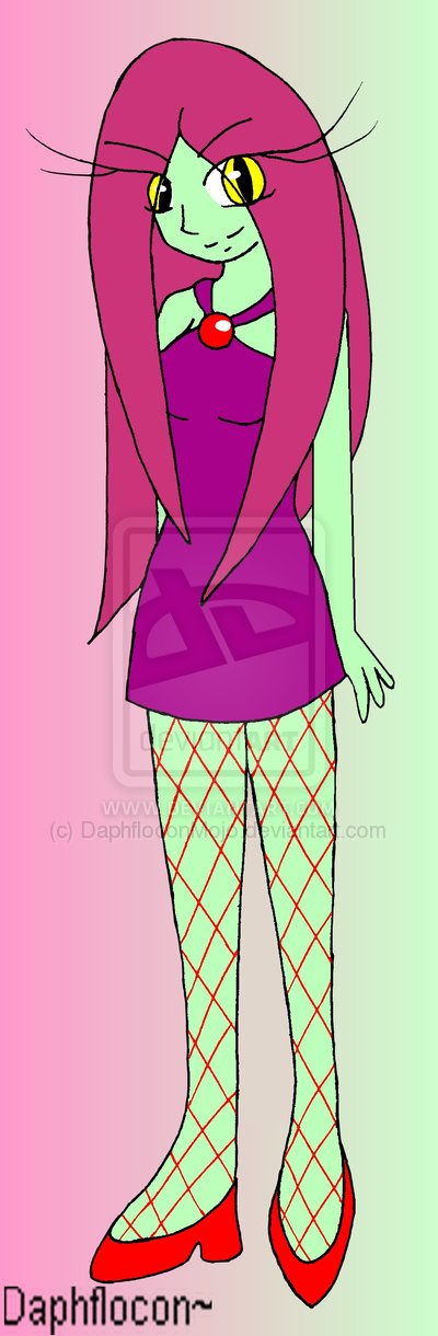
Zamida is absolutely beautiful.  In fact, she's my favourite of all of your Vixyz.  It's not just that she's sexy; she's sexy and confident.
That posture clearly displays her strength of character, and her outfit is simply beguiling.  :3  I've seen high class women in Tokyo wear the same red fish-net stockings.  The heels work well on her, too.

Her face is simply gorgeous.  The snake-like eyes really add to her personality.  The long hair is also very appealing.

(Getting into anatomy here)  I can see that she has a flexible spinal column connecting her upper and lower body, and that her butt sticks out in the back.  She's muscular, and not at all fat.  That's something that men can see - it means she's healthy, and healthy in a woman means attractive.  Don't you love biology?

I'd kill for a date with her, but I'd probably have to fight off a pack of a hundred rabid men just to get to her.  ^_^;


Wiishe Cobaalt (#102)

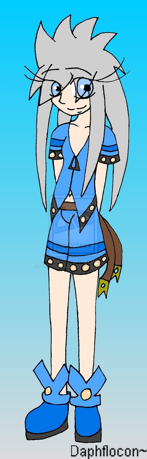
Wiishe Cobaalt is a beauty.  She's my second favourite of the bunch.
Her outfit's visually exciting.  The long eyelashes give her a unique touch that other artists don't typically use.  Her posture is dynamic, too - I can see her balancing her body.
If she were real, I'd be hard pressed not to ask her out on a date, or follow her into some adventurer's haunt.


Viktor Emrys (#96)

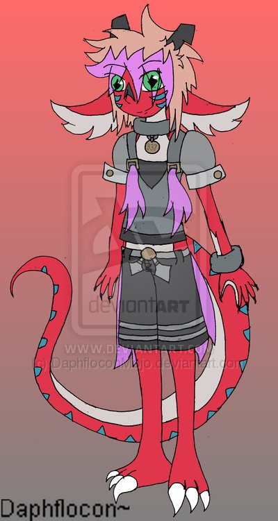
Viktor Emrys is a very well done male character.  I think you were trying to make it look like his chest was wider than your other male characters - and for that I commend you!  Males have a "V" shape with a narrow waist and broad shoulders.  From what I understand, women find it attractive (and guys find it intimidating).
As a character, he's visually complex and has great clothing, to boot.